As well as being a brand shorthand for consumers colour communicates at a more subliminal level and can even impact the bottom line if used correctly.
Following the 2016 rebrand of NatWest, which saw the brand introduce a vibrant graphic identity alongside the return of its 1960s cube logo, the bank is looking at how it can “continue to build equity in the colour purple”, according to the brand’s CMO David Wheldon.
The colour not only creates standout in a sector that more commonly embraces blue and red (think Barclays, RBS, Santander and HSBC) but can signify a range of attributes including integrity and ambition.
“I think you need to spend a lot of time on the basic elements of branding, including the colour and physicality of the brand,” says Wheldon. “And it is time that pays off because when you do really well, you get a seamless benefit of consistency of branding and that turns into a higher impact.”
Hotel group IHG, meanwhile, uses colour to drive awareness and positive brand sentiment.
The Holiday Inn brand, for example, uses colour to tell both an old and new story. At the core of the colour palette is green, a colour that has featured in the logo from day one. Green communicates the values that mean the most to the brand: nature, safety, freshness and liveliness.
A secondary palette, comprised of lively yellows, light pink, red and sky blue, signifies the core brand promise around joy and happiness.
“Holiday Inn is a joyful, happy and optimistic brand that delivers personality in a world of franchise hotels,” explains Sangeetha Ramkumar, director, guest experience and design at IHG. “We believe the colour palette helps us stand out and makes the brand more approachable.”
The psychology of colour
A brand may be recognised by name, logo or product type but the first thing to catch a consumer’s eye is often its colour.
“One of the greatest assets and one of the easiest ways to sway decision or attract an emotive response – or alienate a consumer – is through colour,” says June Mcleod, author of Colour Psychology Today. “Purple with Cadbury; Shell with Yellow; National Trust with Green – they all work and work wonderfully well.”
Becoming synonymous with a specific colour, as these brands have done, can represent a huge opportunity when it comes to brand recall and identity. Another brand known for a specific hue is luxe grocer Fortnum & Mason. Its signature shade of turquoise has been present throughout the brand’s 300-year history and is central to its visual experience.
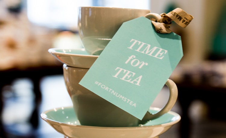
“[The colour] eau de nil is a strong brand signifier – it’s arguably more potent than our name, particularly to a non-English audience,” says Yvonne Isherwood, product and packaging design manager at Fortnum & Mason.
“It’s our best advertising tool, which is why we use it on all our secondary packaging too, from carrier bags to gift boxes,” adds Isherwood. “That said, we’re very careful not to overuse it; the last thing we want is to cheapen it, or for customers to grow tired of it.”
While colour is of course just one aspect of branding, its importance should not be dismissed, argues Laurie Pressman, vice-president of Pantone Color Institute at Pantone, as it has the ability to broadcast instantly the message and meaning of a brand.
“When I look at colour today it has become symbiotic with design and you have to get every element right,” says Pressman. “And, when it is right it works; it just clicks. And that is the engagement process. When one piece of it is off, you take the chance of people walking right past you.”
Getting in the mood
It is well known that colour’s power to influence mood and evoke feelings can make a significant impact on purchasing behaviour but business don’t necessarily exploit this to the full.
In a recent experiment at the point-of-purchase, car manufacturer Honda worked with neuroscience specialist Experience Insight to compare sales transacted in a normal showroom environment with those in a specially created ‘blue pod’.
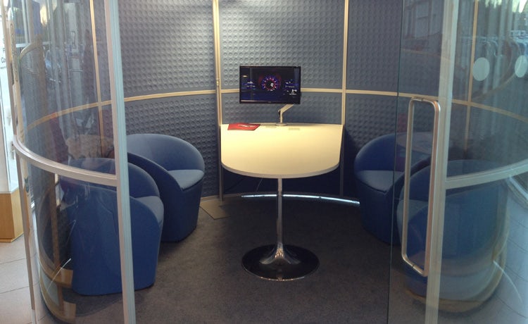
Here, blue walls had a calming influence on the customer, meaning they were more inclined to continue the sales process in a relaxed manner with the sales person. This shift resulted in the average profitability of sales negotiated in the pod being around 35% higher than those taking place in the normal showroom environment.
“My original belief was that colour would have no impact on customer behaviour, so the purpose of the experiment was to establish how the environment, including colour, can influence profitability of sales,” explains Warwick Humphries, managing director of HSH Motor Group, owner of four Honda dealerships.
“The results were compelling, so as far as we as a dealership are concerned, I would have to say colour is a very important part of the overall design strategy for the dealership environment.”
Not all shades of the same colour are equal though. Google famously tested 41 shades of blue for its advertising links before settling on a perfect hue – purportedly earning it an additional $200m dollars in revenue.
Other brands might not put the same weight of science behind their approach but have discovered the benefits that colour can have on sales and brand awareness.
One of the key drivers of beer brand Carlsberg’s strategy on the recent redesign of Carlsberg Export was the Danish concept of ‘hygge’, a balance between the warm and the cool.
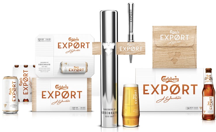
“We introduced white as the primary colour for Export to introduce the ‘cool’, something that’s reflective of white ceramics often found in Danish interiors,” says Lynsey Woods, marketing controller at Carlsberg.
“We then introduced an accent of copper to bring the warmth – inspired by the brewing stills in the Carlsberg brewery and again a colour often found in Danish interiors.”
Working with design specialist Taxi Studio on the project, the brand’s green bottle was also replaced with brown, something that not only cues craft and premium associations but improves the beer by letting in less light.
“It was a big decision to move away from green as the mainstay of the Carlsberg brand for 170 years,” says Woods. “But we’ve seen from results on Export that this has paid off and really helped consumers reappraise the brand.”
These results, which Carlsberg attributes purely to the design versus any communications activity, include 10,000 new distribution points for the brand in the off-trade, an 81% positive sentiment on social media channels and retail sales values up 10% in the 12 weeks to June 2017.
Innovation in colour
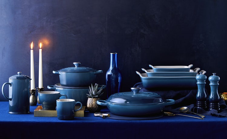
Since 1925 and the production of its first ‘volcanic’ casserole dish, colour has played an integral part in how cookware brand Le Creuset differentiates its offer.
Beyond the original hue, there are now close to 100 colours in the brand’s range. The colours are chosen to be aesthetically pleasing but are also built to resist chipping, cracking, staining and dulling over the life of the cookware.
“Constant innovation in colour allows us to refresh our colour palette regularly and create newness,” says Ingrid Lung, senior brand manager at Le Creuset UK. “It allows us to remain relevant and on-trend as our societies and colour trends are constantly evolving. It also allows us to meet the preferences of our different markets and consumers.”
Le Creuset creates two campaigns a year, one for spring/summer, and one for autumn/winter, which are based on colour, texture, food or lifestyle trends. This approach allows the brand to exploit colour further, challenging the perceptions people have of existing colours and putting a twist on the classics.
Colour which is so carefully manipulated in the commercial world is undoubtedly a potent way of selling product.
“You have one chance to make a first impression and colour plays such a big role in that,” warns Pantone’s Pressman. “People are coming to understand that more and more – I used to say you have three seconds to get someone’s attention. Now I think it is two. You don’t want someone to pass you by.”
Source: https://www.marketingweek.com




Leave a Reply
Your email is safe with us.